Journal / Styling Tips
December 2024
How to choose a colour palette for your event
Colour sets the mood before guests arrive. Here is how we approach palette selection for every celebration we design.
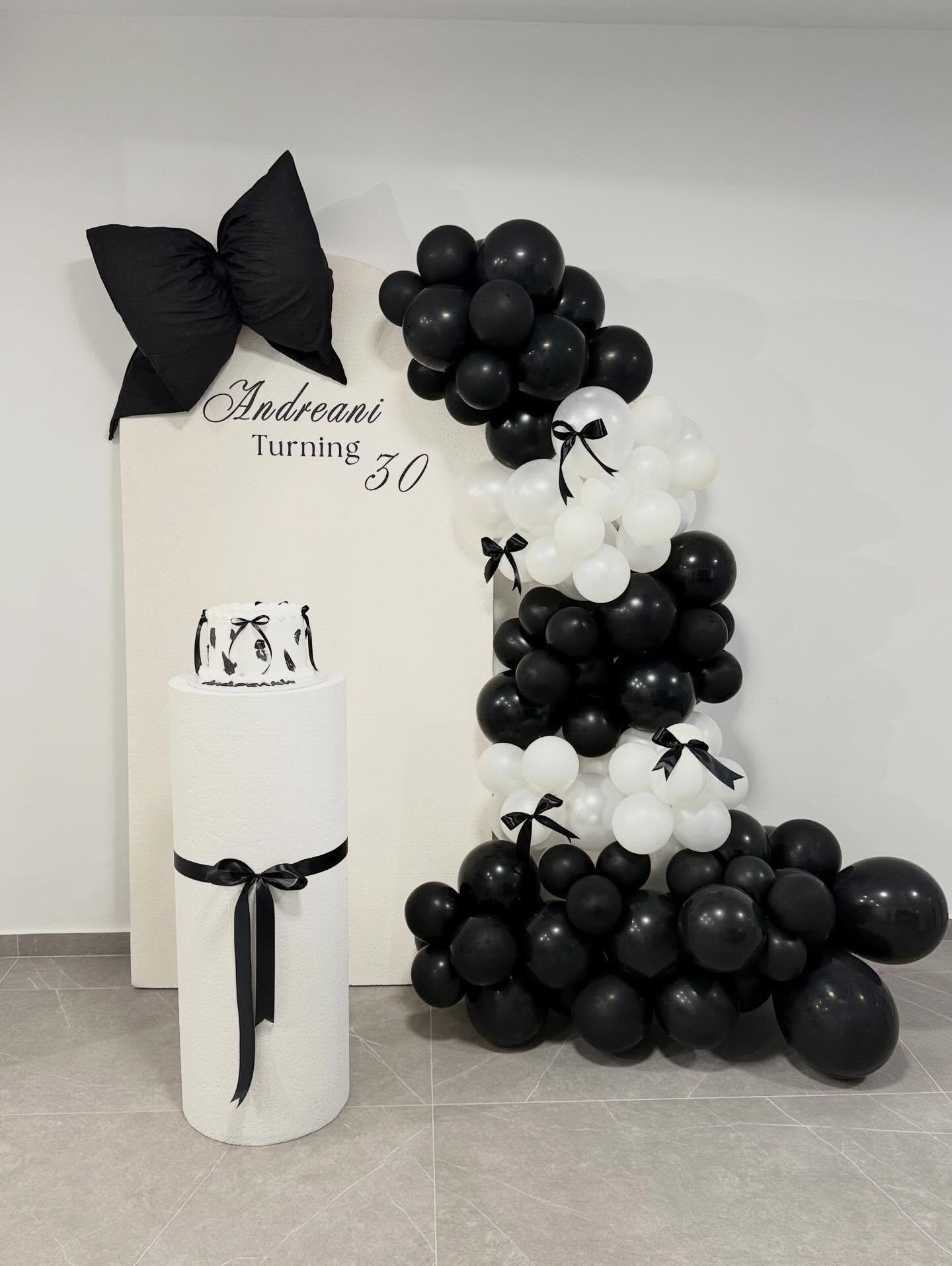
Colour is the very first thing your guests experience when they walk into an event space. Before they read a name, touch a table setting or taste the food, colour has already told them something about the occasion — whether it is joyful, romantic, elegant or playful.
At Aurea, we start every brief with colour. Not as an afterthought, but as the foundation of the entire design concept. Here is how we think about it.
Start with the host, not the trend
The most beautiful event palettes are the ones that feel personal. We begin by asking simple questions: what colours do you naturally surround yourself with? What makes your home feel like yours? What colour do you reach for when you want to feel confident or at ease? Trends come and go — and while we pay attention to what is current in event design, we are always cautious about imposing a palette that feels fashion-forward but disconnected from the person being celebrated.
Think in three
Most strong event palettes work with three colours: a base, a secondary and an accent. The base covers the largest surfaces (linens, backdrops, walls). The secondary fills in the midground (florals, chairs, larger props). The accent does the highlighting work — showing up in smaller doses to add energy and refinement. For example: ivory (base) + sage (secondary) + champagne gold (accent). Or navy (base) + blush (secondary) + white (accent).
Consider the venue and time of day
A palette that looks stunning in a bright garden will read very differently in a candlelit interior. Natural light desaturates colour; artificial light warms it. Before committing to a palette, consider where and when your event takes place.
Texture as a palette extension
Finally, remember that texture is part of the palette conversation. A matte ivory linen feels completely different from a satin one — and both will read differently alongside different floral choices. We always specify textures alongside colours when developing a concept, because the two are inseparable.